Gouache keeps pulling illustrators back to the brush because it behaves so obediently: the water-based paint dries quickly to a flat, opaque, matte colour, yet remains rewettable, so a damp brush can lift a mistake or revive a pan years later. Mid-century commercial artists knew these virtues well, when designers' gouache matched the flat inks of process printing, and studios of the 2020s are rediscovering them with something close to relief.
What exactly is gouache?
Gouache is watercolour's opaque sibling. Both are pigment bound in gum arabic, but gouache carries a heavier pigment load and added inert fillers, traditionally chalk, that make the paint cover in a single pass and dry to a flat, matte surface with almost no sheen. Painters have used the method for centuries — it appears in old sources as body colour — and it comes in tubes for juicy, dense application and in pans for travel and sketch work. Because the binder is water, cleanup is a rinse and the working day needs no solvents. The matte finish is not just aesthetic: it photographs and scans without glare, which is precisely why reproductive media adopted it so eagerly. In use it behaves like thick cream rather than wash: it is pushed across the paper in even strokes, thinned only slightly for smooth flats, and its colour as it dries is dependable enough to plan a whole palette around.
How does gouache compare with watercolour and acrylic?
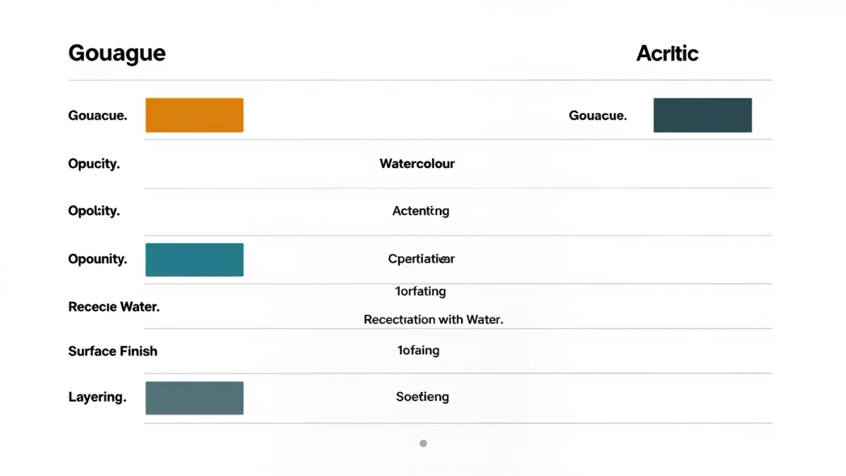
The three water-based paints occupy neighbouring rooms of the same house, and choosing between them is mostly a matter of how you want light and correction to behave:
| Property | Gouache | Watercolour | Acrylic |
|---|---|---|---|
| Opacity | Opaque, covers in one pass | Transparent, built in glazes | Opaque, layered freely |
| Reactivation | Rewets with water | Rewets with water | Waterproof once dry |
| Surface finish | Flat, matte | Luminous, soft sheen | Sheen varies by brand |
| Layering | Light over dark possible | Traditionally dark over light | Any direction, fast |
| Best suited to | Flat graphic colour | Luminous washes | Bold, permanent builds |
The decisive row for illustrators is reactivation: gouache forgives after the fact, while acrylic locks every decision in place.
Why did mid-century illustrators rely on it?
For roughly the middle half of the twentieth century, gouache was the commercial studio's default paint, and the reasons were industrial. Flat areas of even colour photographed cleanly for the letterpress and offset processes that printed posters, packaging, magazines and advertising, and gouache delivered flatness without effort. It dried fast enough to meet brutal schedules, and — crucially for art directors — it permitted correction: a wrong edge could be painted out and redone rather than restarted. Designers' gouache ranges were formulated and marketed for exactly this trade, with pigments chosen to survive reproduction. Studios kept stock racks of tubes within reach of every board, and the sight of a gouache shelf remains the quickest shorthand for a working commercial art room of the era. The look of mid-century graphic art, that confident poster-flat colour, is inseparable from the paint that made it practical.
Why are illustrators returning to gouache in the 2020s?
The revival has several currents feeding it. Matte, flat colour scans and photographs beautifully, and flat fields of hand-mixed hue sit comfortably beside digital design work. The paint rewards a slowed, tactile practice at a moment when many illustrators want their working methods visible in the result — the slight texture of a loaded brush, the edge where one shape meets another. Social platforms, which have carried images of studio work since the 2010s, have taught audiences to love process, and gouache's forgivable, rewettable nature makes it unusually companionable for artists dividing their week between client files and personal practice. Unlike acrylic, it does not consign a palette to the bin overnight; unlike pure digital, it leaves an original. There is also a quiet economy to it: a modest set of tubes covers a wide gamut when mixed, palettes can be revived for weeks rather than discarded, and the matte surface needs no varnishing or elaborate lighting rig to read true on a page.
What should newcomers know before starting?
A few working habits spare most beginner frustrations:
- mix more colour than you expect to need, because a second mix of the same hue rarely matches the first
- use heavy paper — 300 gsm watercolour board or stretched paper — so wet layers stay flat
- let each layer dry before the next, since gouache can be disturbed by overworking
- expect dried colours to dry slightly lighter or darker than they appear wet, and test on scrap
- protect finished originals behind glass or with fixative, as the matte surface can be delicate
- note that acrylic gouache, a popular cousin, dries waterproof and does not rewet
None of these are obstacles; they are simply the terms of the medium, and they are learned within a fortnight of honest painting.
Where can you study gouache work up close?
Museum collections are the best classroom. The open access holdings of the Smithsonian include gouache illustration from across the twentieth century, viewable at resolutions high enough to see how a flat field was built from strokes, and comparable collections in British museums round out the syllabus. Studying the mid-century masters this way — zooming in until the brushwork betrays the method — is the fastest route to understanding why the medium earned its reputation, and why each generation of illustrators that abandons it eventually sends someone back to the art shop for tubes.
For more context, read How Does Watercolour Granulation Work?.
For more context, read book cover illustration.
For more context, read illustrated maps.